
|
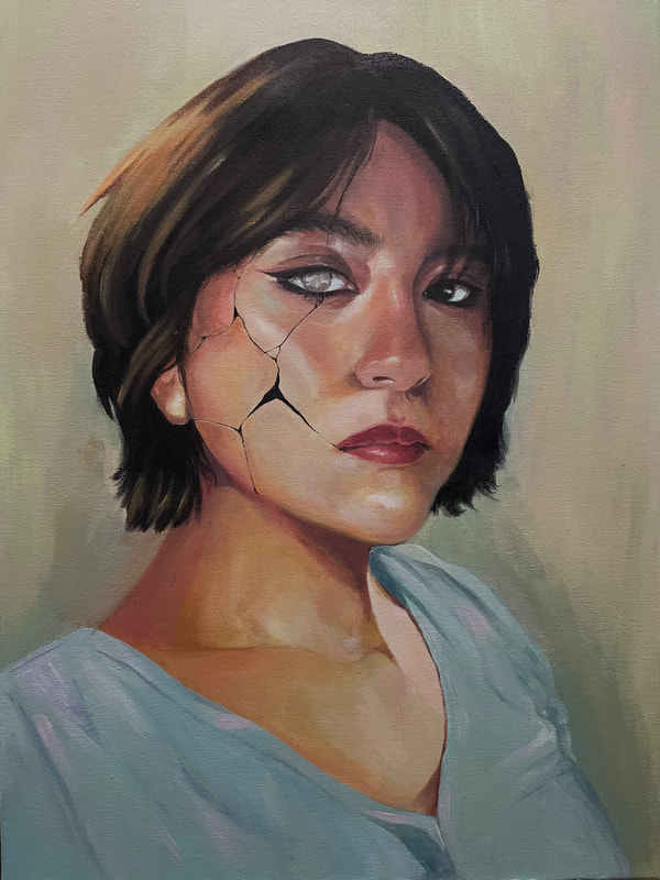
Size: 18 in x 24 in Medium: Acrylic on Canvas Completed: ongoing Exhibition Text: What matters is what’s on the inside, until you don't fit the beauty standards. “Beautiful Demise” represents this in the form of a porcelain doll, who is very fragile but so beautiful, until it's broken, becoming a scary thing. I created it with Tom Roberts painting style in mind.
|
Inspiration: Tom Roberts

Portrait of Florence by Tom Roberts
|
Tom Roberts is an Australian artist from 1856-1931 who was involved in the Heidelberg School art movement or Australian impressionism movement. He worked primarily with oil paint and created a variety of portraits and landscapes. Tom was one of the four artists that brought impressionism to Australia from England and France, as that's where he was first introduced to the movement. However, compared to French impressionism, his work was done more cleanly and “formal”. His influence helped create a multitude of impressionist paintings depicting Australian rural life as he was involved in creating painting camps around the suburbs. Tom Roberts alongside Arthur Streeton, Charles Conder and other painters, took an exhibition to Melbourne known as the The 9 by 5 impression exhibition, consisting of 183 artworks, many of the works were painted on cigar box lids and were max 9 by 5 inches. However at the time, Australian critics were not really fond of the whole ordeal, and were left unimpressed. The reason this exhibition is well-known and important is due to it accurately portraying life during the time of federation in Australia. One of his most popular pieces is “The Big Picture” 1903, a accurate representation of the opening of the first parliament of the commonwealth, which is now stationed in the Parliament House.
Not only that but Tom Roberts is known as the “father of indigenous landscape painting” in Australia. This particular painting “Portrait of Florence” was created in 1898. Roberts created lots of portraits of women wearing the fashion preeminent in that time period. He was very attentive when it came to painting portraits, very evident in the many colors of the flesh he was able to produce. . The woman in the painting is Florence Greaves who was actually a painter and a fellow student of Roberts. |

James T. Donovan by Tom Roberts
|
Using Tom Roberts artworks, I wanted to make a painting revolving around beauty standards. Some people are so used to seeing perfect faces with no blemishes, no acne, and all around attractive people, and when they see someone without those attributes, they are made fun of. I wanted to poke fun at the whole, the beauty is what’s on inside, quotes as well as the absurd beauty standards set upon teens on social media. By choosing a porcelain doll as my main attribute, I wanted to incorporate it in a smart way. Porcelain dolls are very perfect and very pretty, I wanted that whole idea to represent the beauty standards. The shattered doll was to represent the many people that don't fit those beauty standards, I wanted it to either represent breaking those beauty standards, or the idea that the breakage represents what doesn't fit the beauty standards and the effects it has on teens mental health, at times making them feel as if they are nothing and that beauty ultimately determines their whole character.
|
Planning:

|
Before starting my planning sketches I more so began brainstorming the meaning I wanted to go off, my first idea was loneliness, and how overtime you feel yourself drifting away, the breakage representing this. However, the more I thought about it, I realized I could tie this into beauty and the insane beauty standards. I first began my planning process with an initial sketch of what I want to do. I was more so going for a feeling or loneliness for my first sketch and only added the cracked face a couple days later after I did my second sketch. This piece was to be more background based, as the background was going to be filled with a mix of dead to live flowers, depicting how being alone can sometimes be therapeutic but also suffocating. My second sketch is similar to the first one, but instead it is a portrait. I liked this one a bit better than the first since the breakage in the face is made the main vocal point of the piece. This one in particular fit more with what I was going for meaning wise, which is why I chose it.

|
After I was done with my sketches I made a replica of my final sketch with an edit of myself. I first took a photo and adjusted the picture color settings then I sketched the broken face on myself. I also cut out the background to make it easier to sketch when the grids were added. I made sure to make the edit the same size as the canvas to avoid any difficulties during the sketching process. Most of the editing process was me editing the original picture and fixing the colors since it had a lot more reds and dark shadows (I took it in a dark room).
|
Process:

|
I started off with 9 x 12 inch grids and started following the edit I made. I didn’t realize this while sketching but, the grids that were present on the edit compared to the ones on my canvas are different lengths/sizes, therefore the sketch came out a bit different. I had a lot of trouble getting my features right, especially the nose and eyes. Once I had finished the sketch I went around and fixed the eyes but then gave up and decided I'll fix them later with paint. I think the problem is I made the eyes too big and should be just a bit closer. As for the nose, the picture is a bit blurry in parts so, that would be something I'll fix with paint later on as well.
|
|
I first began the painting by adding a base coat of all the colors I want to use. Not focusing on putting details I added colors where needed, like shadows, highlights, blush. Due to me adding shading to my sketch, a lot of the paint became muddy when I put it on the canvas, and although it did bother me at first, I like the way it looks. Initially, I was going to go for a more smooth blended look for this painting, however I really liked how the brush messy brush strokes looked so I decided to continue painting like this for the remainder of the painting. Looking back at my inspiration I also realized his work is not smooth as you can still see the brush strokes so this worked out perfectly. For the base, I used lots of greens, yellows and orange, originally I was going to follow the same color palette as Tom Robberts as he uses a lot of blue and red hues however, after adding green to the base, I really liked how it looked.
|

|
|
After the skin base colors were all painted on, I added another layer of paint, this being my more refined version. However, as I continued painting, I encountered a problem. The colors I was using just did not resemble my inspiration at all and they weren't working well with each other, and were clashing with one another. The painting also began looking “flat” there was no dimension, I believe it was the lack of darker tones that made it look that way. I also at some point began painting the eyes however they were not looking realistic, so I painted over them and started over. At this point I took a step back and just looked at my piece. Then I went and studied Portrait of Florence by Tom Roberts. I realized I needed to use a lot more pink and red colors, evident in the cheekbones of the model in his painting, and just very dark colors in order to add dimension to the piece.
|

|

|
Going over Tom Roberts style really helped in enhancing my piece. I began by once again, using what I last painted as a base. I added a lot more peach, and orange skin tones however I made sure not to fully erase the under layer, I wanted some of the colors to peek through since the skin tends to have lots of undertones. I also began making the highlights a lot more dramatic, especially on the cheekbone and eye area, which I then realized was a different approach to Tom Roberts as his painting of Florence is a lot more subtle and softer.However we can compare this to my other inspiration by James T. Donovan. I also added a lot more darker tones and it really made a difference in the piece, as it makes everything stand out, by adding dimension to the piece and making it look more realistic.I also began painting the eyes, I added a gray/blue/beige color to the white of the eyes due to plain white making it look to harsh and began adding very light shading to it as well as pink the the inner corners of the eye. After that I painted around the eyes, I tried adding creases where seen however not too harshly as I noticed if I added too much, I either looked tired or a lot older. This whole part of the process relied on just building up colors and having patience. In order to blend the colors I would use one brush to lay the paint, and a dry brush to flutter around the paint.
|

|
Then I began adding a lot more detail to the piece. I started off by painting the lips. Lips are my least favorite part to paint so I tried to get it over with, at first they looked very out of place due to the pink I used and almost gave up on them, however one I added shading, and built up the colors, it became cohesive with everything else. I re-worked on the eyes a bit as well, fixing the pupils and adding harsher shadows with black and brown, at first I avoided using black however in my reference, the eyes are almost jet black, and I couldn't mix a darker color with the primary colors so i opted with just using black. I added highlights to the eyes once I finished and then I began adding the main part of my piece. As seen in my planning stage, I wanted to add a broken effect on the skin like a porcelain doll. While looking at references, It seems the breakage is almost jet balck, as porcelain dolls are hollow inside, it's nothing but darkness inside and I wanted to show that.
|
Experimentation:
|
I experimented a lot with what skin tones I could blend with just the primary colors and white. I began my mixing darker tones, seeing how dark I could make the colors, and what colors were essential for that. For darker tones, purple is needed which can be mixed with red and blue, from there you add a bit of yellow and more red. This gets you a brown-ish purple cool color, which works well for shading, and it is a good alternative to using black. With the same ratio a warm toned brown can be achieved, instead however add orange (red and yellow) this will make a warm toned brown that I will later use to add shading in the lighter areas of the skin. If I want a more muddy color however, I can add a bit or green, which can also make the color darker as long as an excess of green isn't added. I followed this process when doing my actual painting, only added black when really needed.
|

|
Even during the actual painting process, I ended up experimenting a lot with colors. I went back and forth between the colors I wanted to work with for the skin tone starting off with more yellow and orange tones to then green and red/orange tones,
Critique:
|

|
Similarities: Both paintings work in adding great depth of contrast most evident in the hair and skin. The hair is a dark color, closer to black, alongside the skin that has lots red, blue, and orange hues. The blending for both paintings is very smooth regardless of the different in paint use.
Differences: Tom Roberts tends to use cool tones with some warm tones to emphasize the cool tones, as he used pastel colors. However I instead used warm tones all throughout only using cool tones in some parts. The difference in this is prevalent as my painting looks a lot more harsher and bright in color while Tom Roberts looks muted and soft.
Differences: Tom Roberts tends to use cool tones with some warm tones to emphasize the cool tones, as he used pastel colors. However I instead used warm tones all throughout only using cool tones in some parts. The difference in this is prevalent as my painting looks a lot more harsher and bright in color while Tom Roberts looks muted and soft.
Reflection:
This was by far one of the most challenging and time consuming pieces I’ve done. I noticed greatly that I improved a lot on mixing colors, balancing skin tones, and in general painting with acrylic. Most of the inspiration for my paintings are semi realistic artwork and due to the difficulty of blending with acrylic, I've had lots of trial and error and time to understand the medium, so I have found ways to blend with it in order to replicate the realistic look of oil paints. The blending may not be as smooth as oil paints but I am happy with my patience in making it work. I was able to successfully go back and forth from painting and studying my inspiration to make sure I was at least trying to replicate his overall painting style, which I feel I was somewhat successful in doing based on my critiques. His style was very difficult to replicate as his painting looked very soft even when very harsh shading it was evident, that was something I couldn't copy as my painting looks harsh all throughout. If I were to go back and fix something it would be that, as the soft look was what attracted me to his pieces in the first place. I would also use more cool tones in contrast to warm tones, as I feel like that was a factor in my piece not having the same look and feel as Tom Roberts painting.
Connections to ACT:
1. Clearly explain how you are able to identify the cause-effect relationship between your inspiration and its effect on your artwork?
While Tom Roberts wants to portray the beauty of his era, as well as his own ideals, I want to instead show the effect of beauty standards on a person. His painting in turn, is a lot more softer, as in painting wise and in general her features look a lot more softer to the eye, while mine is a lot more harsher.
2. What is the overall approach the author has regarding the topic of your inspiration?
Tom Roberts doesn't talk much about beauty standards however he does mention trying to replicate the beauty of the time period the the Spanish era. He was fond of the more traditional ways of beauty and tried to capture that in his portraits of various women.
3. What kind of generalizations and conclusions have you discovered about people, ideas, culture, etc. while you researched your inspiration?
Rather than learn something new, I decided to find articles that supported my statements for my inspiration. I found out that studies on beauty standards have shown that it often leads people to develop depression, eating disorders and self-esteem problems as well as many more.
4. What is the central idea or theme around your inspirational research?
My central idea revolved around beauty standards and the effect it has on teens to achieve them. They are so absurd that in turn become impossible to achieve, causing major damage to one's self esteem.
5. What kind of inferences did you make while reading your research?
Women tend to be the main demographic targeted with these beauty standards. Due to society's idea of ideal feminine beauty, women often develop shame and self hatred towards their own body and whole being.
Citations (MLA FORMAT)
- https://en.wikipedia.org/wiki/Tom_Roberts
- Britannica, The Editors of Encyclopaedia. "Impressionism". Encyclopedia Britannica, 21 Mar. 2022, https://www.britannica.com/art/Impressionism-art. Accessed 14 October 2022.
- https://www.artgallery.nsw.gov.au/collection/works/OA10.1959/#bibliography
- https://thebeautyholic.com/psychological-effects-of-beauty-standards/#:~:text=Studies%20have%20shown%20that%20such,their%20exposure%20extends%20to%20adulthood.
