A Moment in Time

|
Medium: Oil on canvas
Size: 36 in by 36 in Completed: May 19, 2022 Exhibition Text: The calming atmosphere of mother nature. A place you can go whenever you feel lonely, a place to rest to relieve stress. Relating to my times during quarantine where I had to learn to live with myself and accept who I am. Experiencing lots of self-growth, I learned a lot about myself, what I want, and who I want to become. It’s all a matter of whether I accept myself or not. Inspired by John Everett Millais painting, Ophelia, and the calming yet sad atmosphere he created with the usage of colors and unity.
|
Inspiration:

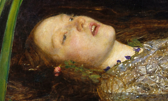
Ophelia by John Everett Millais
Before even figuring out my inspiration, I knew I wanted to do a painting that involved water. Especially with oil paints being so easy to blend, I felt water would be a fun task to do with oil paints. As I was looking through painting, I came across John Everett Millais, who did a painting called Ophelia. This painting was made to represent a scene from one of Shakesphere's play, Hamlet. Made during the Pre-Raphaelite art period, in which British artists made a group in opposition to newer art, and to sticking to medieval and early renaissance art. Greatly working with realism and depicting love and death. John Evertt’s Ophelia is said to represent growth and decay of our ecosystem, as well as making each flower represent a different meaning, for example, the red flower represents death and sleep.
Due to John being a part of the Pre-Raphaelite period, his art, or more so this painting, has lots of bright and rich colors. Each line was made to show a real depiction of a person, and nature. Going off color again, we can see that the lady’s face is very pale compared to the colors around her, the expression also seems very emotionless. Done intentionally as in Shakespeare's story, it seems as if she drowned, therefore John wanted to portray this scene as close as possible.
The reason as to why I chose this particular painting is because I really liked the composition of it. Everything works well with each other and although there are many things going on in it, the lady is what catches your eye and is the center of attention. For my self portrait, I wanted a piece where the person is the main subject so this one felt perfect. Not only that but I like the touch of colors (the flowers) against the dark water, it adds a nice contrast to the piece and also adds movement to the piece, as to not just look at the woman, but everything else around her. Overall, I like how calming the piece seems.
Ideas/Rough Sketches :
|
Although my painting is to be a copy of John Everett Millais painting, I wanted to add different subjects. For example I want to play around with the flowers. In his painting, he mentioned that the flowers have different meanings, therefore I want to choose my own flowers and put meanings for them. For one, I would like to add red roses as they are my mothers favorite flowers, and funny enough, her name is Rosaura, which can be abbreviated to Rosa, rose in Spanish. I also thought of adding pictures sinking into the water, each one having a picture of me from different times, when I was little, a teenager, each having a caption, however one will have the caption “adult” in which it is crossed off.
|

|
|
My ideal goal was to follow the painting, Ophelia, step by step and add a couple of my own things. However, as I was working, I instead opted for following the piece. The things I wanted to add were a lot, and I felt it would make the piece look crowded. I also had no experience with painting water and did not want to do too much, as I could mess up my artwork. Not only that but (as mentioned in the Process section), I was already having lots of trouble with this piece therefore, did not want to strive to much more out of my comfort zone than I already was.
|

|
Process:

|
First I began by doing {} by {} grids. This was the most time consuming process of the whole piece as covering the whole canvas in squares is so much different than doing a small piece of paper. Midway through I was going to give up and just sketch the painting however, I noticed that the perspective could be very hard to replicate without grids and can come out looking structurally wrong, so I opted that idea out. Once I finally finished the grids I did a coat of very light gray to the painting with very watered down acrylic. I personally can't stand drawing on a very white canvas as it hurts my eyes so I do this. However, in some parts of the painting, I put way too much paint so I had to go over it to preserve the grids. Once I was done I started my sketch, making sure to count the squares and making sure each subject was drawn in its correct place (however I ended up miscounting many times, visible during the painting process.)
|

|
Once I was done with the sketch, I took a break to figure out what to start with first. I asked my mom, since she has had more experience with painting, what subject I should start with, the background or the woman, she told me the woman she began by doing that. Due to this being a self portrait however, the lady has to be me so I went to a well lit area and began taking pictures of myself in the same pose the lady was in. However, I didn't really have anyone to take them from me so instead I improvised, I only took pictures of my head in the same angle she's in and I photoshopped myself into the painting. Color Coding it to fit the colors of the piece, and it worked (this process was done during the sketching process.) That's when I began painting. Luckily, the oil paints my mom has already had a skin color that was perfect for this piece. I used that color as a starting point, and put blue, red, green and browns on the side to mix into that color to add shading.
|
|
I broke down each part of the piece in sections to make the painting process a lot more easier, it also allows me to focus on one thing and put all my concentration of THAT thing instead of moving onto something else with it uncompleted. I began with doing the face, and hands. Focusing on the face, I began by filling the whole face, except the nose, eyes and lips with the main color of the skin. Little by little I adding shading, using different tones of brown as shown in the picture. I sometimes used a q-tip to blend the colors together for a smoother look. After I was done with the basic shading, As in John Everett's piece, the blends of the colors are very soft and well blended, for that realistic look . Then, I moved onto the nose, I wanted to keep the sketch visible therefore I didn't work on it while doing the rest of the face. I first made an outline of the nose, then like the other parts of the face, I build up the colors little by little. For the color palette, I tried to stay as close to possible to warm, yellow/orange tones for the face with a bit of red here and there. Although while painting, I realized I liked how the red looked therefore ended up adding more of it to the face. I wanted to also make the were the muscles/ bone are prominent, like the next, since the lady is looking over the water while her body is sinking, I wanted the viewer to physically see the next being strained or muscle being used. That is honestly my favorite part of the piece as I like how well the blending turned out as in Ophelia, the blending is what make the artwork realistic. |

|

This was the first hand I started with. Luckily for this piece I was following the same hands used on John Everett piece. As the pose was too hard to recreate by myself, I had to accommodate to this idea. The difference however, is that I had to follow the colors I chose for my piece rather than the ones on Ophelia. I was very nervous for this part of the piece, especially this hand, as the angle is very difficult. However, I feel as though it came out better than expected. Personally, I like it better than how the face looked. However I was having trouble doing the shading as in John's piece, he uses very hard shading on the bottom half of the fingers and I was having trouble replicating that. I used lots of red for this piece, making sure to keep the lights and dark's from touching, and rather than blending the shading completely, I kept some of it as to show the stop between both colors better.
|

As for the second hand, this one came by easier due to what I gathered from doing the other hand, however it was still a bit difficult as the perspective was very different. Looking back at both the hands, This hand in particular came out different compared to the other one. I feel this is due to the other hand having more shading and darker colors, something I forgot to focus on with this hand, therefore will go back to fix it later on to match. To fix this I will add darker shading to the index and middle fingers as to replicate John Everett's piece, as in his piece, those two fingers are the ones with the darkest shading on them.
|

(All together.)
Time skip! I didn't take pictures of the background process however i'll explain, For the water I mostly used black/dark blue with purple, adding a bit of brown, light brown and green when needed. Due to the water being so dark, black was the color.
For the wood area at the top, I made sure I did that ahead of time before doing the tiny green leaves on top of the water, however i did add a turquoise layer on it. Once the wood dried. thats when I began adding detail to the leaves. I grabbed a old dry brush and dabbed on light greens and white paint to it to replicate the texture.
For the wood area at the top, I made sure I did that ahead of time before doing the tiny green leaves on top of the water, however i did add a turquoise layer on it. Once the wood dried. thats when I began adding detail to the leaves. I grabbed a old dry brush and dabbed on light greens and white paint to it to replicate the texture.
|
For the clothing, I decided not to do the same dress used in Ophelia, since it was very hard to recreate and it isn't necessarily something I see myself wearing. I went on pinterest and began looking at which dresses, as I still wanted the color of the dress to be similar. While looking, I found a very nice white dress and opted to doing that one. While doing the dress, I was having lots of trouble making it look realistic to say, the colors were not working with each-other and I was in general having a rough time. I started to get frustrated and just added color after color hoping it would work out in the end. However, this made the clothing look more flat. In John Everett's piece, the clothing is nicely done, and although the details are very small they are very prominent. I was trying to portray that with the dress I choose but it was not working out. This may be due to the fact that I only used black, grey and white, I didn't try to use other colors like I did with the rest of the piece, staying within the same color range the whole time caused it to look flat. That's when I decided to take a break and focused on something else. |

|
|
As noticed, I changed the clothes from the picture above. I wasn't sure but I was not liking the dress. Since I was not following John Everett's piece when it came to the clothes, this process was very hard. The reason I changed the white dress, was because I thought I didn't like it due to me not wearing dresses that often, I felt that maybe that made me feel disconnected from the piece. However when I was done doing the new set of clothes, I also did not like it. This made me very frustrated as now I had to wait for the paint to dry to re-do it.
I began going on social media and looked at different dresses. I felt doing a dress will ultimately be more easier for this piece and not only that but will look better due to how flow-y they are underwater. That was something I wanted to portray. I tried to find dresses that I felt I would for sure wear as the dress I originally chose the first time, although looked pretty, was not fit for me which lead to me feeling disconnected with it. |

|
|
After I began thinking that maybe I should the the dress in more of a muted, light brown color, thinking it would perhaps blend in better with the whole piece. As I began painting the new dress, I already felt that it was in unison with all the other elements. After I was done with the dress I also began doing the leaves and the flowers, these were done with acrylics due to time, however I think they came out very nice.
|

|
Compare & Contrast:
|
|
|

|

|
Hand Similarities:
Hand Differences:
- We both use warm tones sticking with reds and oranges.
- Another similarity is the form, although blending technique is different, you are able to tell it is a 3-dimensional object. This was something I was worried I would not be able to show, however it does in fact look like a hand.
Hand Differences:
- The main colors used are different from each other. I use a lot more red colors compared to John Everett's usage of orange tones. This is due to my personal liking of red tones over orange tones, I also tend to work better with them than orange.
- Perspective is a bit different, this is really noticeable in the second hand. As compared the John Millais piece, the hand look more crunched up.

|
|
Face Similarities:
- The facial expression is mostly the same, especially in this eyes, you can see this melancholy look in both my piece and John Millais piece.
- .John Millais uses a variety of colors in his piece while I say within the same color scheme of orange, pinks and browns. Something like this is inevitable since I don't have much experience with oil paints.
Reflection:
This painting was full of trial and error. I got frustrated many times when things weren't working out however, when this happened I would take a step back and analyse my inspirations again, to figure out what I was doing wrong. Doing this really helped me improve my piece. Seeing the artists style and their usage of colors, really helped me in achieving what they wanted to portray with their piece. My strongest point in this piece is the blending, as I felt i was able to blend the colors very well especially in the face, making the change in colors seamless. My favorite part of the painting however is the neck and the hands. For the next I just really like the smoothness of the shading and the general composition of it, as for the hands, they just came out better than I expected them to. I have a love- hate relationship with hands, sometimes they come out well or sometimes they don't, but I love the way they came out here, one of my strongest points in the piece. As for what I would do differently next time, I'll perhaps figure out the clothing situation first, maybe do a bit of photo-shopping to it like I did with my face to the piece to make the whole process much easier. Be more organized as well, it's something that I struggled with a lot including time management, things behind the scenes could've been done better.
Connections to ACT:
1. Clearly explain how you are able to identify the cause-effect relationship between your inspiration and its effect on your artwork?
There's a huge difference in what I want to portray with this painting and the message I want it to convey compared to John Everett's meaning for this piece. My piece revolves around self acceptance, while his revolves around death and decay.
2. What is the overall approach the author has regarding the topic of your inspiration?
My general approach was regarding my topic required me to really put myself in the past. I don't necessarily remember the most about quarantine during COVID-19 therefore I really needed to do some digging into my memories.
3. What kind of generalizations and conclusions have you discovered about people, ideas, culture, etc. while you researched your inspiration?
I learned about the approach of art, and how art in general was perceived around these times. As John Everett Millais himself was apart of the Pre-Raphaelite period in which art was done to be as realistic as possible.
4. What is the central idea or theme around your inspirational research?
The central idea/theme relates around my experience during a world pandemic therefore I didn't have to do much research. For my artist inspiration, I had a certain idea in mind, water had to be apart of the painting, that was my general idea while looking for an artist.
5. What kind of inferences did you make while reading your research?
Working with oil paints is a very tedious process the requires the out-most patience from the painter. If you try to rush it, it shows greatly.
Citations (MLA FORMAT)
https://www.tate.org.uk/art/artworks/millais-ophelia-n01506
https://www.tate.org.uk/art/art-terms/p/pre-raphaelite
https://en.wikipedia.org/wiki/Ophelia_(painting)
https://medium.com/@550496694/the-visual-analysis-of-the-representation-of-women-in-sir-john-everett-millaiss-ophelia-1851-d5a1cf7aa2e9
